


Introduction
Hello everyone.
In this article, I will show you how to build a "Flowmodoro" app using SvelteKit.
What is Flowmodoro?
Flow + modoro (i.e. pomodoro) =Flowmodoro
And so, "Flowmodoro" is Pomodoro, but better suited to maintain the flow state.
Using Pomodoro, one must stop after intervals of around 25 minutes. But in Flowmodoro, you can stop whenever you feel your focus drifting (e.g. 50% of its peak). The break time would be calculated based on how long you worked.
Francesco Cirillo developed Pomodoro based on a countdown timer. But Zoe Read-Bivens devised Flowmodoro, based on a stopwatch.
And so we begin.
Project Setup
Pre-requisites
This blog post assumes familiarity with Svelte, a JavaScript frontend framework.
Installation
npm create svelte@latest my-app will create the project files. Ensure to select a Typescript project.
For this project, we'll need both Tailwind CSS and daisyUI to style the front end.
First, read the guide to install Tailwind CSS with SvelteKit. Now, install daisyUI as a plugin.
Finally, we will need an icons library. My preference is Feather, for its simplicity.
npm i svelte-feather-icons
Declaring the Main Page
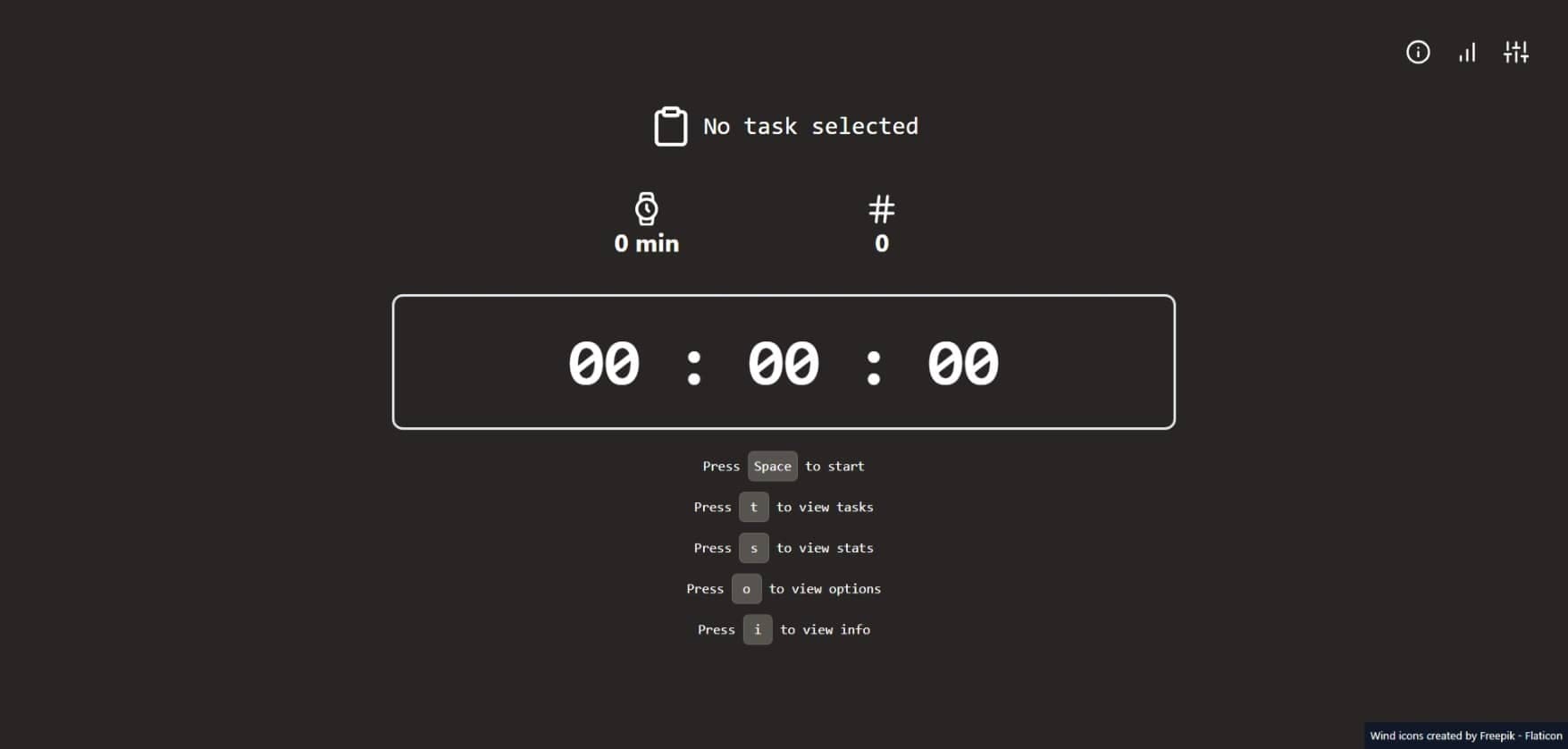
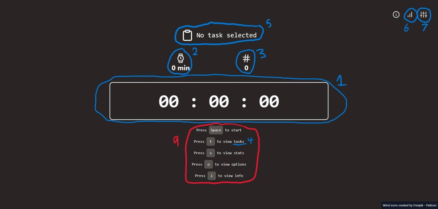
The following provides the general order in which we will tackle each section of the application.
Let's start with the layout, in routes/+layout.svelte. Here we will set the page title, and add styling to the HTML body.
<script>
    import '../app.css';
</script>

<svelte:head>
    <title>Flowmodoro</title>
</svelte:head>

<main class="w-full h-full flex flex-col items-center justify-center">
    <slot />
</main>

<style lang="postcss">
    :global(body, html) {
        width: 100%;
        height: 100%;
        background: theme(backgroundColor.stone.800);
        color: theme(colors.white);
    }
</style>
And now, in routes/+page.svelte, we can declare the Svelte code for the entire application at the widest level.
<script>
    import InterruptionsCounter from '$lib/InterruptionsCounter.svelte';
    import EstimatedBreakTime from '$lib/EstimatedBreakTime.svelte';
    import Stopwatch from '$lib/Stopwatch.svelte';
    import KeyboardHelpText from '$lib/KeyboardHelpText.svelte';
    import TasksDisplay from '$lib/TasksDisplay.svelte';
    import CurrentTaskText from '$lib/CurrentTaskText.svelte';
    import StatsDisplay from '$lib/StatsDisplay.svelte';
    import OptionsDisplay from '$lib/OptionsDisplay.svelte';
    import InfoDisplay from '$lib/InfoDisplay.svelte';
</script>

<div class="flex-1 w-full max-w-6xl flex flex-col justify-center items-center">
    <div
        class="absolute top-0 right-0 display flex flex-row justify-center items-center p-12 space-x-4"
    >
        <InfoDisplay />
        <StatsDisplay />
        <OptionsDisplay />
    </div>
    <div class="mt-12 flex w-3/5 py-2 flex-col justify-center items-center space-y-3">
        <CurrentTaskText />
        <div class="flex w-full flex-row justify-around items-center">
            <EstimatedBreakTime />
            <InterruptionsCounter />
        </div>
    </div>
    <Stopwatch />

    <div class="text-xl text-center font-mono mt-8 space-y-4">
        <!-- Saving here for later -->
    </div>

    <TasksDisplay />
</div>
Stores
In $lib/stores.ts, we will define the states that power the entire application.
import { get, writable } from "svelte/store";
import { browser } from "$app/environment";
Running Time
The amount of time the user has been working, in milliseconds.
export const running = writable(0);
Interruptions
The number of interruptions the user experiences during a work session.
export const interruptions = writable(0);
Start Time
The time at which the user started their work session. This is useful for displaying their work stats later on.
export const startTime = writable(0);
Break Duration
This store holds the duration of the user's break, in milliseconds. This is so that it can be counted down to 0 during breaks.
// Set to 1 instead of 0 to avoid playing the timer sound on startup,
// since the timer sound will play whenever breakDuration reaches 0
export const breakDuration = writable(1);
Tasks
In this application, users can create tasks like they would in any other to-do list app. But we will also track the user's work sessions for each task.
export interface Task {
    id: string,
    name: string,
    checked: boolean,
    // Use an array.
    // The user may not always complete the task in 1 session.
    stats: StatsRow[],
}

export interface StatsRow {
    interruptions: number,
    workTime: number,
    breakTime: number,
    timeStartedAt: number,
}
But these tasks also need to be saved after the user closes the application. Or else, how can they track their progress over time? This is where we will use LocalStorage.
// If the browser is available, use the value in LocalStorage
// as the initial value. If not, use a default empty array
const defaultTasks: Tas[] = [];
const initialTasks: Task[] = browser ?
    JSON.parse(window.localStorage.getItem("tasks")) ?? defaultTasks
: defaultTasks;

export const tasks = writable<Task[]>(initialTasks);

// The ID of the selected task
export const selectedTask = writable("");
Then, once the value of tasks changes, we can update the LocalStorage copy.
tasks.subscribe((value) => {
    if (browser) {
        window.localStorage.setItem("tasks", JSON.stringify(value))
    }
})
Settings
The options the user has to configure the application. Similar to tasks, we will persist settings in LocalStorage.
export interface Settings {
    breakRatio: number,
    timerSound: string,
}

const defaultSettings: Settings = {
    breakRatio: 5,
    timerSound: "bell",
}
const initialSettings: Settings = browser ?
    JSON.parse(window.localStorage.getItem("settings")) ?? defaultSettings
: defaultSettings;

export const settings = writable<Settings>(initialSettings);

settings.subscribe((value) => {
    if (browser) {
        window.localStorage.setItem("settings", JSON.stringify(value))
    }
})
State
There are 3 application states:
export enum States {
    // The user hasn't yet done anything
    UNSET,
    // The user is working and time is counting up
    RUNNING,
    // The user is taking a break and time is counting down
    BREAK
}
Initialise the writable store, with the default as UNSET:
export const state = writable(States.UNSET)
We can now subscribe to the state store to run code whenever the state changes.
state.subscribe((value) => {
    // ...
});
To start, we can record the current time once the stopwatch begins:
if (value === States.RUNNING) {
    startTime.set(Date.now());
}
If the user is on break, or they have reset the application, we can reset their current data:
if (value === States.RUNNING) {
    startTime.set(Date.now());
} else {
    // ...

    interruptions.set(0);
    running.set(0);
    startTime.set(0);
}
Finally, we can handle the specific case of taking a break. We must calculate the break duration, and then update the user's stats for their selected task.
if (value === States.BREAK) {
    // Calculate the break duration
    const breakTime = get(running) / get(settings).breakRatio;
    breakDuration.set(breakTime);

    // Update the stats for the task
    tasks.update((value) => {
        const currentTaskId = get(selectedTask);
        // Get the task object for the selected task by its ID
        const currentTask = value.find((item) => item.id === currentTaskId);

        if (!currentTask) return value;

        currentTask.stats.push({
            interruptions: get(interruptions),
            workTime: Math.round(get(running) / 1000),
            breakTime: Math.round(breakTime / 1000),
            timeStartedAt: get(startTime)
        })

        // Add the updated task object to the tasks store array
        return [...value.filter((item) => item.id !== currentTaskId),
            currentTask
        ]
    });
}
Before we leave the stores file, we can subscribe to breakDuration so that the state changes to UNSET once the break is over.
breakDuration.subscribe((value) => {
    if (value <= 0) {
        state.set(States.UNSET);

        // Play the timer sound
        playSound(get(settings).timerSound);
    }
})
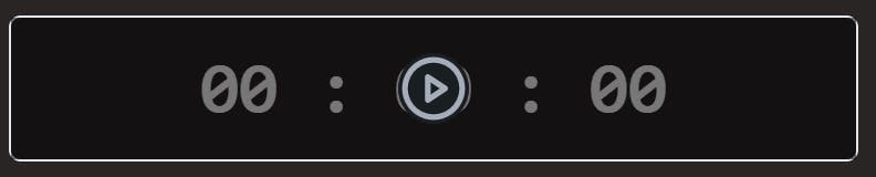
The Stopwatch
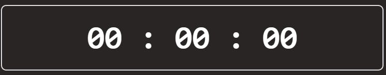
The code for this component lives in $lib/Stopwatch.svelte . There are 2 parts: the digits on the screen, and an overlay with buttons. For example, when the state is UNSET:
Create a new file $lib/TimeDisplay.svelte. Here is where we decide whether to count up (during work), or count down (when taking a break).
Updating Running Time
First, define a function updateRunningTime that will carry out the logic outlined above. We use requestAnimationFrame to repeatedly call the function, which passes a timestamp for us to calculate the delta time.
<script lang="ts">
    import { onMount } from 'svelte';
    import { running, state, States, breakDuration } from './stores';

    let previousTimestamp: number;

    const updateRunningTime = (timestamp: number) => {
        if (previousTimestamp === undefined) {
            previousTimestamp = timestamp;
        }

        const deltaTime = timestamp - previousTimestamp;

        switch ($state) {
            case States.UNSET:
                break;
            case States.RUNNING:
                $running += deltaTime;
                break;
            case States.BREAK:
                $breakDuration = Math.max($breakDuration - deltaTime, 0);
                break;
            default:
                break;
        }

        previousTimestamp = timestamp;

        window.requestAnimationFrame(updateRunningTime);
    };

    onMount(() => {
        const request = window.requestAnimationFrame(updateRunningTime);

        return () => {
            window.cancelAnimationFrame(request);
        };
    });
</script>
Formatting Running Time
Since we update either the running store or the breakDuration store, we must decide which of the 2 to display.
// ...

let displayTime: number;

$: switch ($state) {
    case States.UNSET:
        displayTime = 0;
        break;
    case States.RUNNING:
        displayTime = $running;
        break;
    case States.BREAK:
        displayTime = $breakDuration;
        break;
    default:
        break;
}

// ...
Now, we can work on how to output the time (which is in milliseconds).
First, we can calculate the total equivalent number of split seconds, seconds, minutes and hours.
// There are 100 'splitSeconds' in 1 second
$: splitSeconds = Math.floor(displayTime / 10);
$: seconds = Math.floor(splitSeconds / 100);
$: minutes = Math.floor(seconds / 60);
$: hours = Math.floor(minutes / 60);
Then, we can place these values into an array and display them in the markup:
<script lang="ts">
    // ...

    $: time = [hours, minutes % 60, seconds % 60, splitSeconds % 100];
</script>

<p class="text-8xl group-hover:cursor-none font-bold font-mono">
    {#each time as item, i}
        <!-- If no whole hours have passed (i = 0),
            don't display the number of hours -->
        {#if !(item === 0 && i === 0)}
            <span>
                {item.toString().padStart(2, '0')}
                {#if i !== time.length - 1}
                    :
                {/if}
            </span>
        {/if}
    {/each}
</p>
Overlay with Buttons
In $lib/StopwatchOverlay.svelte, we will include buttons that change the application's state.
<script lang="ts">
    import { state, States } from './stores';
    import { PlayCircleIcon, StopCircleIcon, RefreshCwIcon } from 'svelte-feather-icons';
    import StateButton from './StateButton.svelte';
</script>

<div
    class="w-full h-full absolute top-0 left-0 space-x-24 flex-row items-center justify-center group-hover:bg-[#00000088] group-hover:cursor-pointer hidden group-hover:flex"
>
    {#if $state === States.UNSET}
        <StateButton title="Start" newState={States.RUNNING} activateOnSpace Icon={PlayCircleIcon} />
    {:else}
        {#if $state !== States.BREAK}
            <StateButton title="Stop" newState={States.BREAK} activateOnSpace Icon={StopCircleIcon} />
        {/if}
        <StateButton title="Reset" newState={States.UNSET} Icon={RefreshCwIcon} />
    {/if}
</div>
Note that the "Start" and "Stop" buttons can be activated with the Space bar.
Defining State Buttons
Add the following code to $lib/StateButton.svelte:
<script lang="ts">
    import { state, States } from './stores';
    import { onMount, SvelteComponent } from 'svelte';

    export let title: string;
    export let newState: States;
    export let activateOnSpace: boolean = false;
    export let Icon: typeof SvelteComponent;

    const onClick = () => {
        $state = newState;
    };

    onMount(() => {
        if (!activateOnSpace) return;

        const keyHandler = (event: KeyboardEvent) => {
            if (event.key === ' ') {
                onClick();
            }
        };

        window.addEventListener('keypress', keyHandler);

        return () => {
            window.removeEventListener('keypress', keyHandler);
        };
    });
</script>

<button class="btn btn-circle w-24 h-24 hover:bg-[#00000099]" {title} on:click={onClick}>
    <svelte:component this={Icon} size="100%" />
</button>
Displaying Break Time
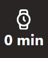
Create the file $lib/EstimatedBreakTime.svelte and insert the following:
<script lang="ts">
    import { running, settings } from './stores';
    import { WatchIcon } from 'svelte-feather-icons';

    $: breakTime = Math.round($running / $settings.breakRatio / 1000 / 60);
</script>

<span title="Est. Break Time" class="text-4xl font-bold text-center">
    <WatchIcon class="mx-auto my-1" size="50" />
    {breakTime} min
</span>
Counting Interruptions
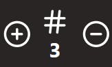
Now, in InterruptionsCounter.svelte, we will work with our interruptions store.
<script lang="ts">
    import { interruptions } from './stores';
    import { HashIcon, PlusCircleIcon, MinusCircleIcon } from 'svelte-feather-icons';

    const btnClassName = 'btn btn-circle btn-ghost hidden group-hover:block absolute';
</script>

<div class="group relative flex flex-row items-center justify-between px-20 py-12">
    <button class={`${btnClassName} left-3`} on:click={() => ($interruptions += 1)}
        ><PlusCircleIcon size="50" /></button
    >
    <span title="Interruptions" class="text-4xl font-bold text-center">
        <HashIcon class="mx-auto my-1" size="50" />
        {$interruptions}
    </span>
    <button
        class={`${btnClassName} right-3`}
        on:click={() => ($interruptions = Math.max($interruptions - 1, 0))}
        ><MinusCircleIcon size="50" /></button
    >
</div>
Re-usable Modal Component
Remember sections 4, 6, and 7 of the application? The tasks display, the stats display, and the options display, respectively?
Well, they will all display modal dialogues. So, we can create a component to reuse across the app.
Create a new file $lib/DisplayModal.svelte and add the following code:
<script lang="ts" context="module">
    let locked = false;
</script>

<script lang="ts">
    import { onMount } from 'svelte';

    // When `triggerKey` is pressed, `isOpen` will be set to true
    export let triggerKey: string;
    export let isOpen: boolean;
    export let title: string;

    const showModal = (show: boolean) => {
        isOpen = show;
        locked = show;
    };

    onMount(() => {
        const keyHandler = (event: KeyboardEvent) => {
            if (!locked && event.key === triggerKey) {
                showModal(!isOpen);
            }
        };

        window.addEventListener('keypress', keyHandler);

        return () => {
            window.removeEventListener('keypress', keyHandler);
        };
    });
</script>

<dialog class="modal" class:modal-open={isOpen}>
    <div class="modal-box w-5/6 max-w-4xl">
        <header class="px-8 w-full flex flex-row justify-between items-center">
            <h2 class="font-bold text-4xl">{title}</h2>
            <slot name="header" />
        </header>
        <div class="flex flex-col w-full px-12 my-8 space-y-8">
            <slot name="body" />
        </div>
        <div class="modal-action">
            <button class="btn" on:click={() => showModal(false)}>Close</button>
        </div>
    </div>
</dialog>
In Svelte, a script element with context="module" will only run once. No matter how many component instances there are. So, that makes it the best place to put our locked variable. This is to stop other modal instances from opening if one is already open.
Managing Tasks
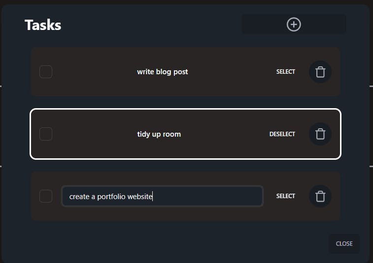
Now in a new $lib/TasksDisplay.svelte, we can use our modal component, bound to the "t" key. We also include a button to create a new task, which updates the tasks store.
<script lang="ts">
    import { PlusCircleIcon } from 'svelte-feather-icons';
    import { tasks, state, States } from './stores';
    import TaskDisplay from './TaskDisplay.svelte';
    import DisplayModal from './DisplayModal.svelte';

    let isOpen = false;

    const createTask = () => {
        $tasks = [
            ...$tasks,
            {
                id: crypto.randomUUID(),
                checked: false,
                name: '',
                stats: []
            }
        ];
    };
</script>

<DisplayModal triggerKey="t" bind:isOpen title="Tasks">
    <button
        slot="header"
        class="btn btn-wide h-12 py-1"
        disabled={$state !== States.UNSET}
        on:click={createTask}><PlusCircleIcon size="100%" /></button
    >
    <svelte:fragment slot="body">
        {#each $tasks as task, index (task.id)}
            <TaskDisplay {task} {index} />
        {:else}
            <p class="text-lg">No tasks created yet. Add one!</p>
        {/each}
    </svelte:fragment>
</DisplayModal>
Checking Off a Task
Now we can create the individual TaskDisplay components, in $lib/TaskDisplay.svelte.
Let's start with the script:
<script lang="ts">
    import { tasks, selectedTask, type Task, state, States } from './stores';
    import { TrashIcon } from 'svelte-feather-icons';
    import { onMount } from 'svelte';

    export let task: Task;
    export let index: number;

    let isEditing = false;

    // ...

    $: isSelected = $selectedTask === task.id;
</script>
And for the markup, we can begin with the checkbox.
<div
    class:outline={isSelected}
    class="outline-4 flex flex-row justify-start items-center bg-stone-800 px-5 py-8 rounded-xl text-xl"
>
    <input
        type="checkbox"
        bind:checked={task.checked}
        on:change={onUpdate}
        class="checkbox checkbox-lg"
    />

    <!-- More Svelte here soon -->
</div>
In onUpdate, we update the tasks store with the new version of the task.
const onUpdate = () => {
    const taskIndex = $tasks.findIndex((item) => item.id === task.id);
    if (taskIndex === -1) return;

    $tasks[taskIndex] = task;
    $tasks = $tasks;
    isEditing = false;
};
Editing Tasks
In this component, we can display the task's name either through a text input or a regular text display. We use isEditing to dictate that.
<div class="ml-6 flex-1">
{#if isEditing}
<input
type="text"
placeholder="Enter task name"
class="input input-bordered w-full text-lg"
bind:value={task.name}
disabled={$state !== States.UNSET}
on:keypress|capture={(event) => {
if (event.key === 'Enter') {
onUpdate();
}
event.stopPropagation();
}}
/>
{:else}
<button
class="h-max btn btn-ghost w-full normal-case text-lg"
class:line-through={task.checked}
on:click={() => {
if ($state === States.UNSET) isEditing = true;
}}> {task.name} </button
>
{/if}
</div>
Notice the event.stopPropagation. This stops the Space bar from being handled by our Stopwatch component. That is also why we use a capturing event.
Note that we are waiting for the user to press "Enter" to update the tasks. But it doesn't have to stop there. We can also update once the input element loses focus aka "click outside".
For this, we will need a reference to the input element. We get this by adding bind:this={inputElement} to the input element. This also means we must add let inputElement: HTMLInputelement; to the component's script.
So, if the user clicks anywhere except the input element, we can call onUpdate:
onMount(() => {
    const handleClick = (event: MouseEvent) => {
        // On Click Outside
        if (inputElement && !inputElement.contains(event.target) && !event.defaultPrevented) {
            onUpdate();
        }
    };

    window.addEventListener('click', handleClick, true);

    return () => {
        window.removeEventListener('click', handleClick, true);
    };
});
Selecting a Task
<button disabled={$state !== States.UNSET} on:click={onSelect} class="btn btn-ghost mx-4"
    >{!isSelected ? 'Select' : 'Deselect'}</button
>
Deleting a Task
Define a function named onDelete that will filter out the task from the tasks store:
const onDelete = () => {
    $tasks = $tasks.filter((item) => item.id !== task.id);
};
Now, add the corresponding button, using the code below:
<button
    disabled={$state !== States.UNSET}
    on:click={onDelete}
    class="btn btn-circle w-14 h-14 p-3"><TrashIcon size="100%" /></button
>
Displaying the Current Task
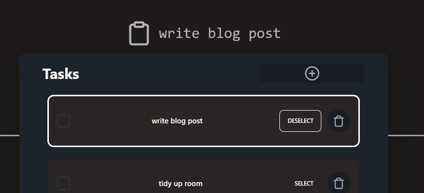
Add the following code to $lib/CurrentTaskText.svelte:
<script lang="ts">
    import { ClipboardIcon } from 'svelte-feather-icons';
    import { tasks, selectedTask } from './stores';

    $: currentTask = $tasks.find((item) => item.id === $selectedTask);
</script>

<div class="flex flex-row justify-center items-center">
    <ClipboardIcon size="64" />
    <p class="ml-4 text-4xl font-mono">
        {currentTask ? currentTask.name : 'No task selected'}
    </p>
</div>
Displaying Stats
Now, in a new $lib/StatsDisplay.svelte, we can create another modal instance, bound to the "s" key:
<script lang="ts">
    import { BarChartIcon } from 'svelte-feather-icons';
    import { tasks } from './stores';
    import DisplayModal from './DisplayModal.svelte';
    import StatDisplay from './StatDisplay.svelte';

    let isOpen = false;
</script>

<button on:click={() => (isOpen = true)} class="w-14 h-14 btn btn-circle btn-ghost p-2"
    ><BarChartIcon size="100%" /></button
>
<DisplayModal triggerKey="s" bind:isOpen title="Stats">
    <svelte:fragment slot="body">
        {#each $tasks as task (task.id)}
            <StatDisplay {task} />
        {:else}
            <p class="text-lg">No data. Do some work!</p>
        {/each}
    </svelte:fragment>
</DisplayModal>
Formatting Seconds
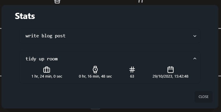
Then, in the individual StatDisplay.svelte components, we can output the stats for a certain task:
<script lang="ts">
import type Task from './stores';
import { HashIcon, WatchIcon, BriefcaseIcon, CalendarIcon } from 'svelte-feather-icons';
export let task: Task;
const formatDuration = (num: number) => {
const seconds = num;
const minutes = Math.floor(seconds / 60);
const hours = Math.floor(minutes / 60);
return `${hours} hr, ${minutes % 60} min, ${seconds % 60} sec`;
};
</script>
<div class="collapse collapse-arrow border border-base-200">
<input type="checkbox" />
<div class:line-through={task.checked} class="font-mono text-xl collapse-title">
{task.name}
</div>
<div class="collapse-content space-y-4">
{#each task.stats as stat}
<div class="flex flex-row justify-around items-center">
<div title="Work Time" class="flex flex-col justify-center items-center">
<BriefcaseIcon size="30" />
{formatDuration(stat.workTime)}
</div>
<div title="Break Time" class="flex flex-col justify-center items-center">
<WatchIcon size="30" />
{formatDuration(stat.breakTime)}
</div>
<div title="Interruptions" class="flex flex-col justify-center items-center">
<HashIcon size="30" />
{stat.interruptions}
</div>
<div title="Started at" class="flex flex-col justify-center items-center">
<CalendarIcon size="30" />
{new Date(stat.timeStartedAt).toLocaleString()}
</div>
</div>
{/each}
</div>
</div>
Managing Options

Add the following code to $lib/OptionsDisplay.svelte :
<script lang="ts">
    import DisplayModal from './DisplayModal.svelte';
    import { SlidersIcon, PlayCircleIcon } from 'svelte-feather-icons';
    import { settings } from './stores';
    import { sounds, playSound } from './sound';

    let isOpen = false;
</script>

<button on:click={() => (isOpen = true)} class="w-14 h-14 btn btn-circle btn-ghost p-2"
    ><SlidersIcon size="100%" /></button
>
<DisplayModal triggerKey="o" bind:isOpen title="Options">
    <svelte:fragment slot="body">
        <div class="flex flex-row justify-around items-center">
            <div class="flex flex-col items-center">
                <p class="font-mono text-2xl">Break Ratio</p>
                <p class="text-sm">For every <i>n</i> minutes of work, take a 1 minute break</p>
            </div>
            <div class="flex flex-col items-center space-y-2">
                <p class="font-bold text-2xl">{$settings.breakRatio}</p>
                <input type="range" min={3} max={5} bind:value={$settings.breakRatio} class="range" />
            </div>
        </div>
        <div class="flex flex-row justify-around items-center">
            <p class="font-mono text-2xl">Timer Sound</p>
            <select bind:value={$settings.timerSound} class="select select-lg">
                {#each Object.keys(sounds) as sound}
                    <option value={sound} class="text-xl">{sound}</option>
                {/each}
            </select>
        </div>
    </svelte:fragment>
</DisplayModal>
Adding Sound

Let's make some noise. You can find some audio files here, which I downloaded from freesound.org.
In $lib/sound.ts, we can first create an object for the sounds that we import, like so:
import bell from "./assets/bell.mp3";
import ring from "./assets/ring.wav";
import scifiBeep from "./assets/scifi-beep.wav";

export const sounds: { [key: string]: string } = {
    bell,
    ring,
    scifiBeep
};
Then, we can create a function named playSound that will play a specified sound, using HTML5 Audio.
But to avoid triggering the same sound repeatedly, instead of creating a new Audio instance each time, we can reuse a top-level <audio> element.
export const playSound = (sound: string) => {
    if (!Object.keys(sounds).includes(sound)) return;

    const audio: HTMLAudioElement | null = document.getElementById("audio-player") as HTMLAudioElement;
    if (!audio) return;

    audio.src = sounds[sound];

    audio.addEventListener("canplaythrough", () => {
        audio.play();
    });
}
So, our #audio-player can be added to routes/+page.svelte:
<audio id="audio-player" />
Updating the Main Page
Listing Keyboard Shortcuts
Add the following code to $lib/KeyboardHelpText.svelte:
<script lang="ts">
    import { state, States } from './stores';
</script>

<p>
    Press <kbd class="kbd bg-stone-600">Space</kbd> to {$state === States.UNSET
        ? 'start'
        : 'take a break'}
</p>

<p>
    Press <kbd class="kbd bg-stone-600">t</kbd> to view tasks
</p>
<p>
    Press <kbd class="kbd bg-stone-600">s</kbd> to view stats
</p>
<p>
    Press <kbd class="kbd bg-stone-600">o</kbd> to view options
</p>
<p>Press <kbd class="kbd bg-stone-600">i</kbd> to view info</p>
Displaying a Break Message
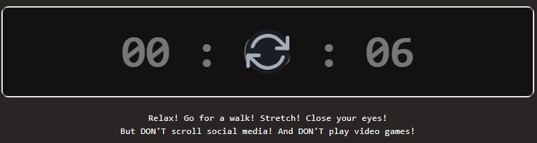
<p>
    Relax! Go for a walk! Stretch! Close your eyes! <br /> But DON'T scroll social media! And DON'T
    play video games!
</p>
Now we can tie these both together in routes/+page.svelte. And make sure to import { state, States } from '$lib/stores'; once you're there:
<div class="text-xl text-center font-mono mt-8 space-y-4">
    {#if $state !== States.BREAK}
        <KeyboardHelpText />
    {:else}
        <p>
            Relax! Go for a walk! Stretch! Close your eyes! <br /> But DON'T scroll social media! And DON'T
            play video games!
        </p>
    {/if}
</div>
Conclusion
And that's all!
With SvelteKit by our side, we built the ultimate solution for focus/time management.
The code for this article is on GitHub, and the app is deployed using Netlify.
If you liked this post, stay tuned for more.
References
SvelteKit | Frameworks | Vite PWA (vite-pwa-org.netlify.app)
SvelteKit • Web development, streamlined
The Technique Better than Pomodoro - Flowmodoro - YouTube
Tailwind CSS - Rapidly build modern websites without ever leaving your HTML.
dylanblokhuis/svelte-feather-icons (github.com)
Using Local Storage with Svelte Stores in SvelteKit | Rodney Lab
How to Take Effective Breaks (And Maximize Your Productivity) (knowadays.com)